工地圍擋怎么包裝才有范兒
來(lái)源:http://mpmy.cn/ 發(fā)布時(shí)間:2022-07-31
工地圍擋可以說(shuō)是具房地產(chǎn)行業(yè)包裝特色的廣告形式,好的圍擋廣告,可以達(dá)到宣傳并促進(jìn)項(xiàng)目銷(xiāo)售的目的,設(shè)計(jì)不當(dāng)?shù)膰鷫V告,則會(huì)損害項(xiàng)目形象。那么工地圍擋怎么包裝才有范兒?
Construction site enclosure can be said to be an advertising form with the packaging characteristics of the real estate industry. A good enclosure advertisement can achieve the purpose of publicity and promoting project sales. Improperly designed enclosure advertisements will damage the image of the project. So how can the construction site fence be packaged?
工地圍擋的整體布局需要事行細(xì)致規(guī)劃,這跟書(shū)法作品的謀篇布局是一個(gè)道理。字怕成行。當(dāng)一個(gè)字單獨(dú)存在時(shí),不論大小、粗細(xì),它都“自成一體”。但當(dāng)眾多字組成一篇書(shū)法作品時(shí),字的大小、粗細(xì),字與字之間的疏密就得十分講究。
The overall layout of the site enclosure needs to be carefully planned in advance, which is the same as the layout of calligraphy works. Words are afraid of making a line. When a word exists alone, it is "self-contained" regardless of its size and thickness. However, when many characters form a calligraphy work, the size and thickness of the characters and the density between the characters must be very particular.
否則,如果缺乏謀篇與布局,即使每一個(gè)字都很漂亮,也難成為一幅好的書(shū)法作品。同樣,如果按一般戶(hù)外廣告牌制作思路去設(shè)置圍墻廣告,在外觀上就會(huì)平淡無(wú)奇,布局上就起不到出奇制勝的效果。
Otherwise, if there is no planning and layout, even if every word is beautiful, it is difficult to become a good calligraphy work. Similarly, if wall advertisements are set up according to the general idea of outdoor billboard production, they will be ordinary in appearance and will not have a surprising effect in layout.
因此,圍墻廣告相對(duì)其它戶(hù)外廣告來(lái)說(shuō),在布局上要下功夫,既要力求使每一塊廣告牌都精彩,更要注重整體效果,力求整體美觀效果。
Therefore, compared with other outdoor advertisements, wall advertisements should first work hard on the layout, not only strive to make every billboard wonderful, but also pay attention to the overall effect and strive for the overall aesthetic effect.
一般來(lái)說(shuō),圍擋廣告的基本色調(diào)在3種左右為宜,色調(diào)太單一會(huì)顯得過(guò)于平淡,讓人生厭。太多又會(huì)過(guò)于花哨,讓人眼花繚亂,無(wú)所適從。
Generally speaking, the basic tone of the enclosure advertisement should be about 3 kinds. If the tone is too simple, it will be too dull and annoying. Too much will be too fancy, dazzling, at a loss.
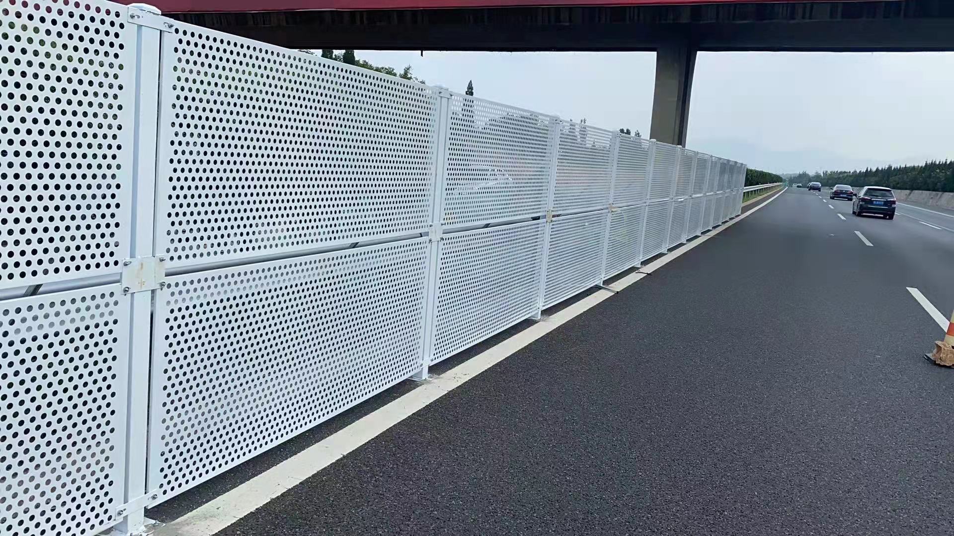

另外,項(xiàng)目建設(shè)工地,大都?jí)m土飛揚(yáng)。如果圍擋的色彩過(guò)于灰暗,再蒙上一層塵土,就更加灰不溜秋了。再者,行人往往匆匆而過(guò),沒(méi)有讓人為之一亮的色彩,就無(wú)法吸引行人眼球。更主要的是,合理的色彩搭配,遠(yuǎn)遠(yuǎn)就能吸引行人的目光,達(dá)到廣告的目的。
In addition, most of the project construction sites are dusty. If the color of the enclosure is too gray, and then covered with a layer of dust, it will be even more gray. Moreover, pedestrians are often in a hurry. Without a bright color, they cannot attract the attention of pedestrians. More importantly, a reasonable color matching can attract the attention of pedestrians and achieve the purpose of advertising.
工地圍擋廣告一般都由多塊相對(duì)獨(dú)立,又互為呼應(yīng)的廣告組成。由于其“陣容”強(qiáng)大,運(yùn)用得好,往往能產(chǎn)生很好的宣傳效果。但是,如果結(jié)構(gòu)上把握不當(dāng),不僅不能發(fā)揮“集群”效應(yīng),可能會(huì)適得其反,給人支離破碎感覺(jué),讓人找不著“北”。
Construction site enclosure advertisements are generally composed of several relatively independent advertisements that echo each other. Because its "lineup" is strong and well used, it can often produce good publicity effects. However, if the structure is not properly grasped, it will not only fail to give play to the "cluster" effect, but may backfire, giving people a sense of fragmentation and making people unable to find the "North".
工地圍擋與其它戶(hù)外廣告內(nèi)容編排與結(jié)構(gòu)有絕然不同。一般戶(hù)外廣告,每一塊廣告牌就是一個(gè)完全獨(dú)立的主體,每一塊廣告牌都有自己完整的內(nèi)容。而圍擋廣告因其整體性,每一塊廣告牌既要有相對(duì)獨(dú)立的內(nèi)容,又必須互為補(bǔ)充,終構(gòu)成一個(gè)完整的主題。
The content arrangement and structure of construction site enclosure are completely different from other outdoor advertisements. In general, outdoor advertising, each billboard is a completely independent subject, and each billboard has its own complete content. Because of its integrity, each billboard must not only have relatively independent content, but also complement each other to form a complete theme.
因此,廣告牌之間必須層次分明,誰(shuí)表達(dá)什么,誰(shuí)訴求什么,須明確分工。否則就會(huì)主次不分。同時(shí),每塊廣告牌又不能各自為政。如果各說(shuō)各的,就會(huì)變得零碎和雜亂無(wú)章。更多相關(guān)內(nèi)容就來(lái)網(wǎng)站http://mpmy.cn咨詢(xún)。
Therefore, there must be a clear hierarchy between billboards, who expresses what, who appeals for what, and a clear division of labor. Otherwise, there will be no distinction between primary and secondary. At the same time, each billboard cannot go its own way. If everyone says his own thing, it will become fragmented and disordered. Come to the website for more relevant content http://mpmy.cn consulting service



 魯公網(wǎng)安備
37018102000522號(hào)